


The hamburger menu is a popular type of navigation, often found on mobile views. After clicking on the icon (three horizontal lines) the drop-down menu displays.
From this manual, you will learn how to create a simple hamburger menu on the mobile view of your landing page. It is possible also to create this menu type at the desktop view.

Hamburger menu on a landing page
1. Log in to your Landingi account and go to the editor of your landing page. Enter the mobile view.
2. Add a new section, e.g., on the top of your landing page.
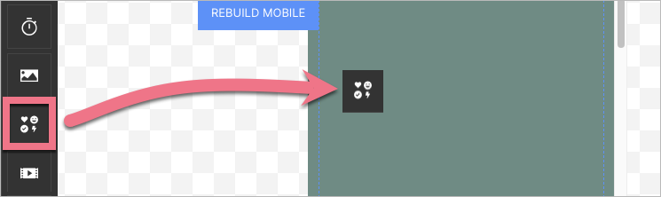
3. Add an icon to this section – drag and drop the icon widget to the chosen place.
4. Search for ‘menu’ and select your icon (or choose any other icon).
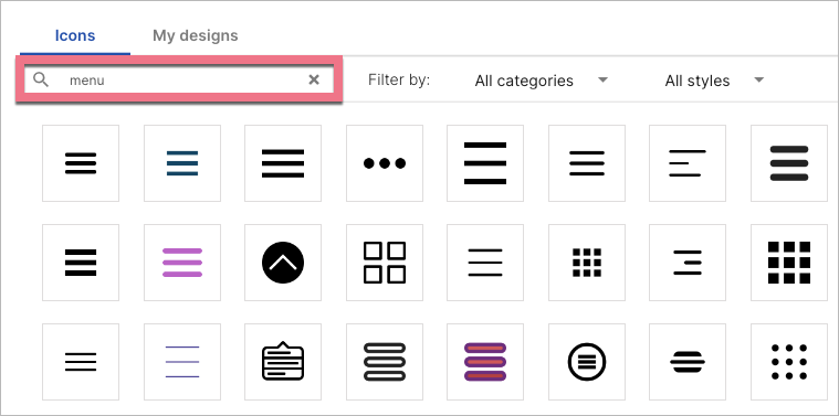
You can adjust icon size or color.
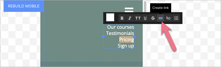
5. Make a navigation menu in the newly created section. You can create them from any elements and widgets. In our example, we used the text widget. Expanding and collapsing will be available after publication. Every menu position links to the landing page section or to the outside URL address. The section background will be the background for both the narrow bar at the top of your landing page (visible when the menu is collapsed) and the expanded menu.
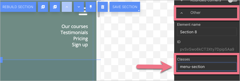
6. Select the section and in the right-side toolbar, find the Other tab. Enter menu-section in the Classes field.
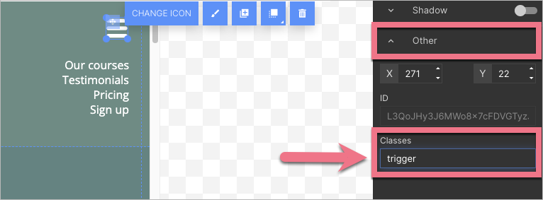
7. Select the icon and in the right-side toolbar, find the Other tab. Enter trigger in the Classes field.
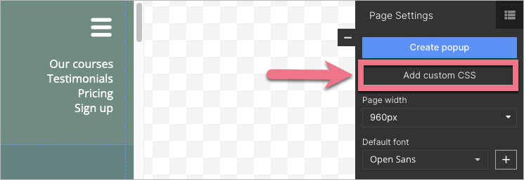
8. Enter the Page Settings on the right panel and click on the Add custom CSS button.
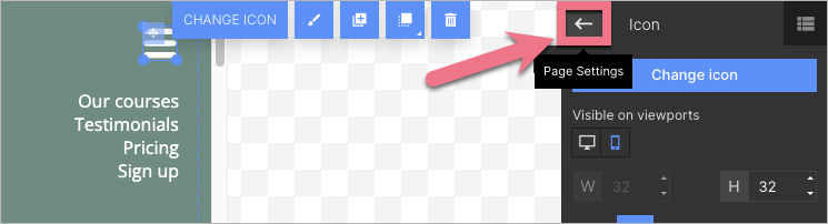
When editing, you can go back to Page Settings by clicking on the arrow:
9. In the Main page tab, paste the CSS code indicated below. If you have also other codes here, add it above them, at the top (@import rule in our code cannot be placed below other CSS codes).
@import 'https://s3-eu-west-1.amazonaws.com/landingi-ftp/script/wow/animate.css';
.trigger {
    cursor: pointer !important;
}

.animated {
    -webkit-animation-duration: .35s !important;
    animation-duration: .35s !important -webkit-animation-fill-mode: both;
    animation-fill-mode: both;
}
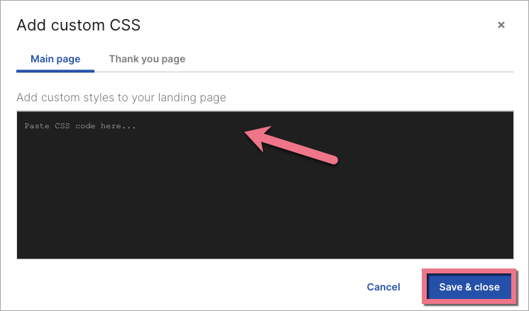
10. Click on Save & close and publish your landing page.
11. Open the menu on the left and go to the JavaScript Code tab. Click Add script.
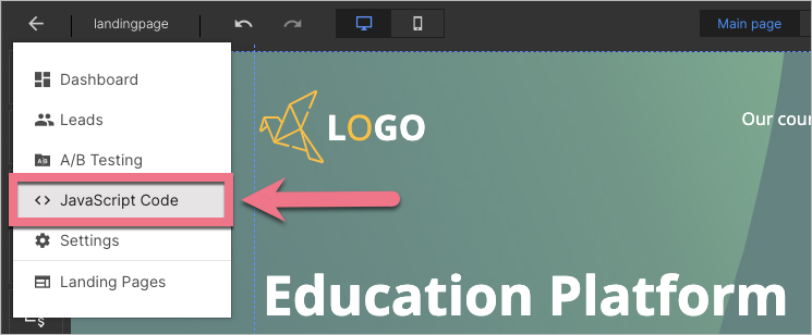
12. In the Content field, paste the JavaScript code indicated below, on the Body bottom position on the Main page.
<script src="https://s3-eu-west-1.amazonaws.com/landingi-ftp/script/wow/wow.min.js"></script>
<script src="https://cdnjs.cloudflare.com/ajax/libs/underscore.js/1.12.0/underscore-min.js"></script>
<script>
  let editorHeight = $('.menu-section').height()
  let minHeight = ($('.trigger').position().top * 2) + $('.trigger').height()
  $('.menu-section .container').css('height', 'inherit')
  $('.menu-section').height(minHeight)
  $('.menu-section > div > div').children().not('.trigger').not('.logo').addClass('menu wow')
  $('.menu').hide()
  new WOW().init()
  function burgerControl() {
    $('.trigger').toggleClass('fa-bars fa-times')
    if ($('.trigger').hasClass('fa-times')) {
      $('.menu-section').animate({height: editorHeight})
      $('.menu').removeClass('bounceOutLeft')
      $('.menu').fadeIn()
      $('.menu').addClass('fadeInLeftBig')
    } else {
      $('.menu').removeClass('fadeInLeftBig')
      $('.menu').addClass('bounceOutLeft')
      $('.menu').hide()
      $('.menu-section').animate({height: minHeight})
    }
  }
  var burger = _.throttle(burgerControl, 650)
  $('.trigger').click(burger)
</script>
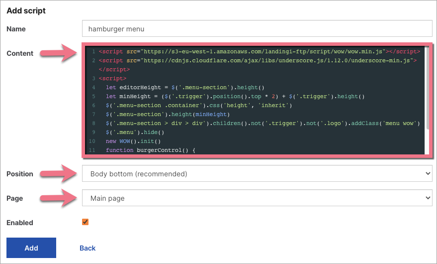
13. Click Add to save the changes.
Enter your landing page on the mobile device and check if it displays correctly.
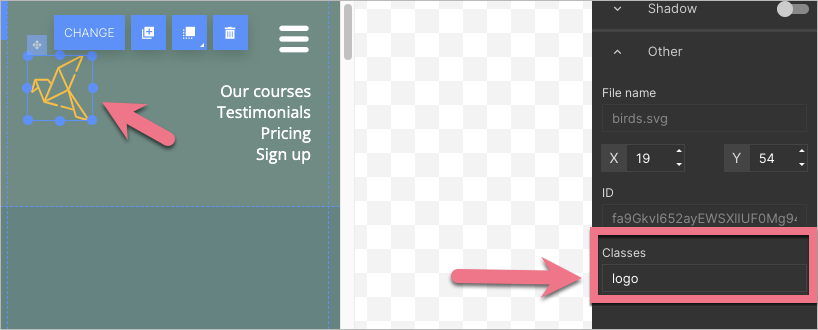
Logo next to the hamburger menu
If you want your logo to be visible in the same section as the hamburger menu, you have to add a class to it.
1. Click on the image (your logo) and in the right-side toolbar, find the Other tab. Type logo in the Classes field.
2. Publish your landing page again.
Now, your logo will be visible when the hamburger menu is both collapsed and expanded.